MIDDLE CLASS TEXT EDITOR
"A rich text editor? In this economy?"
By Nicholas Chen
source
MIDDLE CLASS TEXT EDITOR is an editor library that sprinkles some rich text features on top of a plain textarea without becoming a full fledged full-text editor, hopefully gaining most of the advantages without all of the costs.
Consider something like the caption for an image on Instagram. There is more or less no rich text functionality, except for the ability to tag people. There's no reason you should have to import a huge rich text editor library to implement just that feature - it's completely doable with just a textarea. This is proof of that.
Try changing the names recognized by @: (separate values by newline)
Try changing the projects recognized by # (separate values by newline):
Type @ to mention a person, type # to mention a project. Hover over a person or project for more information.
Some nice details:
Moving the cursor into a keyword moves it through that keyword
Dashes are automatically replaced with non-breaking dashes in keywords. This prevents the styling from falling apart.
From what I can tell, it works reasonably well on mobile.
Some things that don't quite work:
You can still get the styling to break by piling a bunch of keywords onto a line. This results in a pretty localized styling failure that doesn't screw up the entire overlay, and it's also not likely to happen with actual user input, so I'm fine with it.

Undo doesn't work after deleting a keyword. This is really annoying.
Is MIDDLE CLASS TEXT EDITOR right for you?
This library is powerful, but it has some limitations. Because of the overlay styling strategy (explained below), it's not possible to offer bold, italics, or headers. Adding images and links is theoretically possible but a little involved.
However, there are lots of places on the web where you don't need rich text functionality beyond mentions. Instagram photo captions and Slack messages are two good examples of this - Insta captions don't offer rich text at all, while Slack's message editor offers formatting, but is rarely ever used. In both of these cases, the only "rich text" feature that's used is mentions. For these kinds of scenarios, this library is a perfect fit.
Use MIDDLE CLASS TEXT EDITOR in your project:
It's small enough that you can just copy paste the component into your project, ShadCN style. The only external dependency is @floating-ui/dom, used for the autocomplete popup window.
You can find the source for the component here, in the repo.
API Specification
The component takes two props:
content: The contents of the textarea.
keywordMap: An object, where the keys are regex matches for "keyword" and the values are svelte components that will be rendered over those keywords. In the example above, the @mentions and #projects were keywords.
The keyword components accept two props: index, and focusedIndex. index is the order in which the keyword appears on the page, and focusedIndex is the index of the keyword overlapping the caret. This is helpful if you want to highlight keywords when the user moves their caret through one.
How does it work?
Great question! Short answer: By abusing absolute positioning.
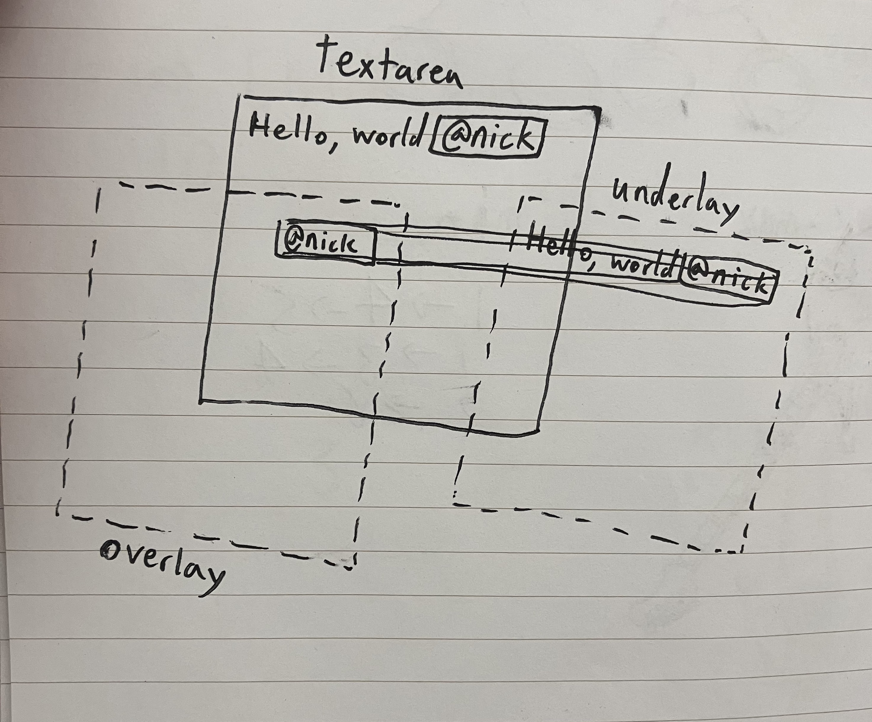
Long answer: I use three elements positioned absolutely so that they're all overlapping: an "underlay div", the textarea, and an "overlay div".
The textarea is where the user types. As they type, the underlay clones the content one for one, but renders keywords differently using a regex match.
The overlay renders all the keywords (again, using a regex match), and positions them absolutely to match their corresponding keyword in the underlay. I use a separate overlay instead of rendering keywords directly in the underlay because otherwise the z-index and stacking context would prevent the keywords from being clickable.
Here's a handy visualization of the setup.

If you got this far and liked my project, consider giving it a star on Github.